How to build a Film Poster: Summerland campaign reopens UK Cinemas
A blended approach, a beautiful setting & a dose of luck: my images for writer-director Jessica Swale redemptive wartime romance help Lionsgate open up UK cinemas.
I love environmental portraiture, getting out in nature and working with a big team, so socially-distanced lockdown has been a little tough, but throughout I was sustained by happy memories of the 2018 Summerland shoot.
Seven weeks on the Sussex coast during one of the most beautiful autumns on record: sun-drenched, quintessential English coastline, by turns bucolic and breathtaking, gentle and raw, with a stellar cast including Gemma Arterton, Gugu Mbatha-Raw, Penelope Wilton and Tom Courtenay.
What was not to like?
Please Release Me
For a while, the pandemic meant it seemed writer-director Jessica Swales feature debut which layers a wartime setting and classic period-drama story-arcs with a nuanced central lesbian relationship and colour-blind casting might not make it to cinemas.
But thankfully, in the UK, Lionsgate decided it is the perfect heart-warming and uplifting film for a back-to-cinemas drive, with a 2 week window before Video-on-demand (VOD) release.
In the US, distributors IFC Films are releasing simultaneously on VOD and theatrically, with Embankment releasing in territories worldwide.
Two Campaigns
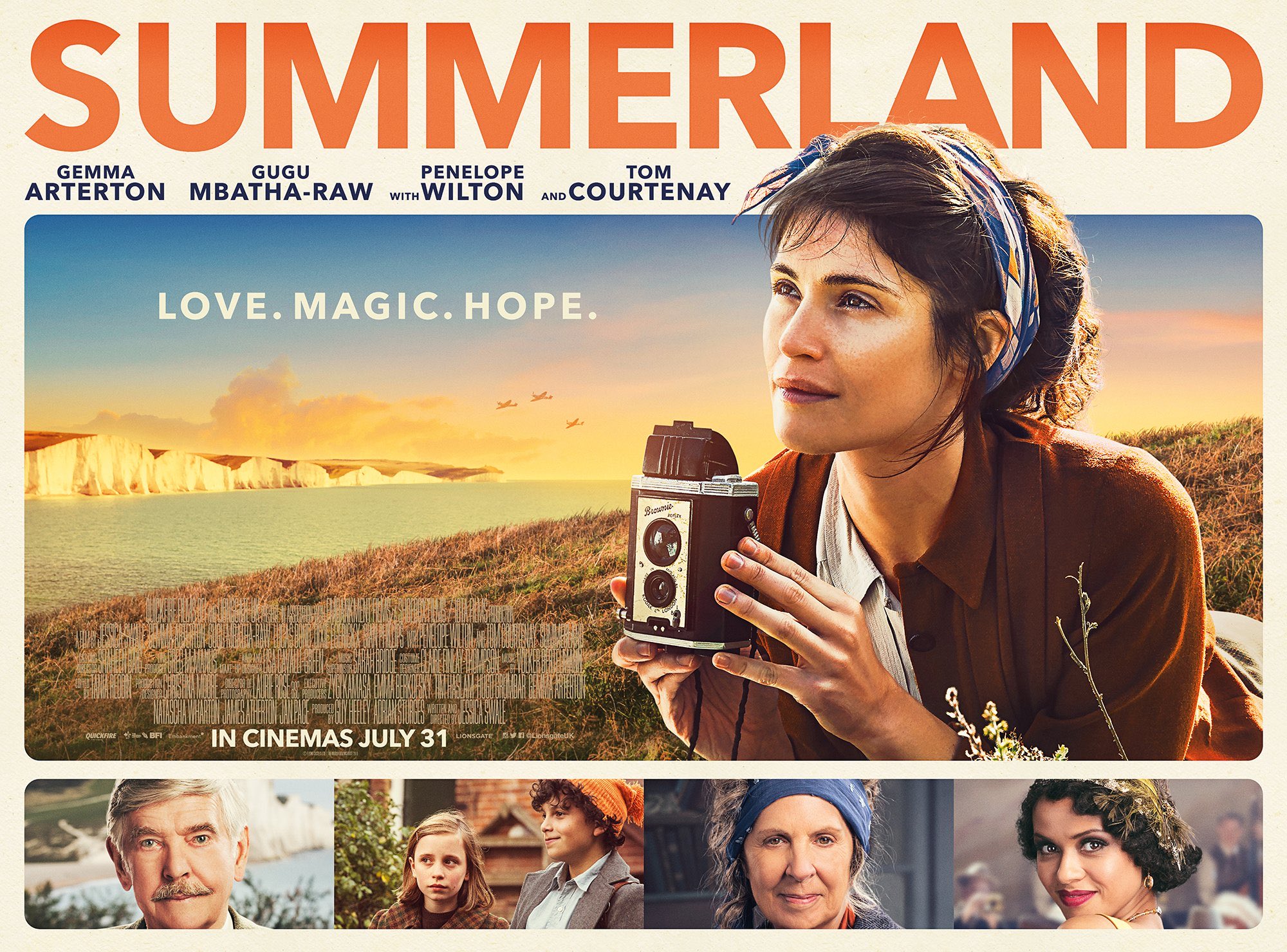
This meant two distinct campaigns, both designed by the expert folks at The Posterhouse.
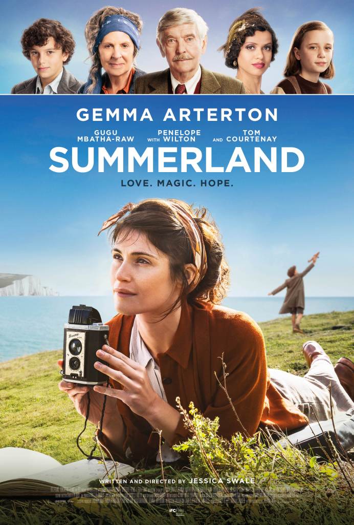
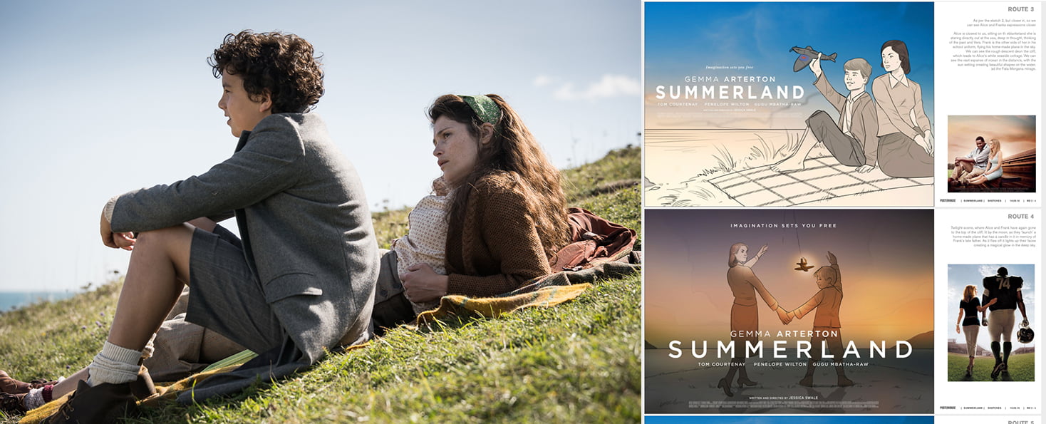
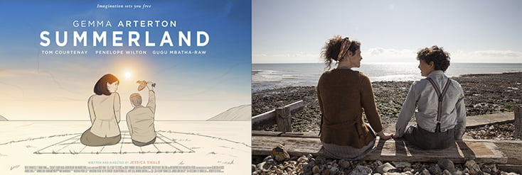
A textured, sunset-pastel version with a neat variation on the cast line-up for the UK market (top), and a more classic Brit-period-drama poster referencing the likes of The Guernsey Literary & Potato Peel Society, for the International crowd (right).
Blending Stills & Specials
Both campaigns use imagery captured by me during filming, combining set-up stills, plate landscapes, studio-shot specials and on-set/Unit stills. In fact, I also shot images that appear in the film as key plot points, but that’s another story!
This image mixture came about because of the way I worked with distributors Lionsgate Embankment, and producers Guy Heeley Adrian Sturges.
I’ve shot film posters as a one-off job before (see Alice Lowe’s Prevenge, for example), and handled some Unit Stills, though I usually prefer creating a shot from scratch on location or in a studio to observing and documenting.
What made a difference on this job was taking a blended’ approach.
After meeting with the producers to discuss aesthetic tone, and chatting to DOP Laurie Rose to get a sense of his shooting plans, we booked in 21 days of stills across the 7 week shoot.
Importantly, The Posterhouse then provided 10+ guide / concept designs for a potential campaign.
This meant that, while recording the drama, scale & setting of each day’s scenes in stills as well as BTS shots I was always shooting with one eye on a final marketing campaign.
You can check out a selection of the currently released Unit Stills here
2. Tailored Set Up Stills
As I got to know the actors and the rhythm of set, production gave me free license to shoot with them between takes & work with the gaffer to set up more complex shots on location.
Filming permitting, of course, and you have to know when it’s right to ask and when to keep your head down
There were times when the available light and setting so closely mirrored poster concepts that we were able to capture shots with the polish of advertising imagery, for just a few minutes work between scenes.
That saved time and money, making the most of the beautiful location with the actors in character & costume.
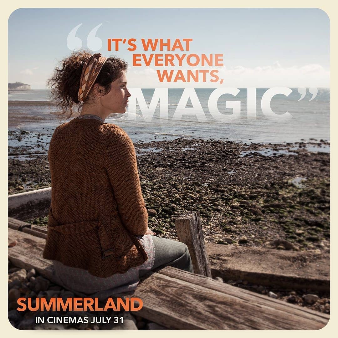
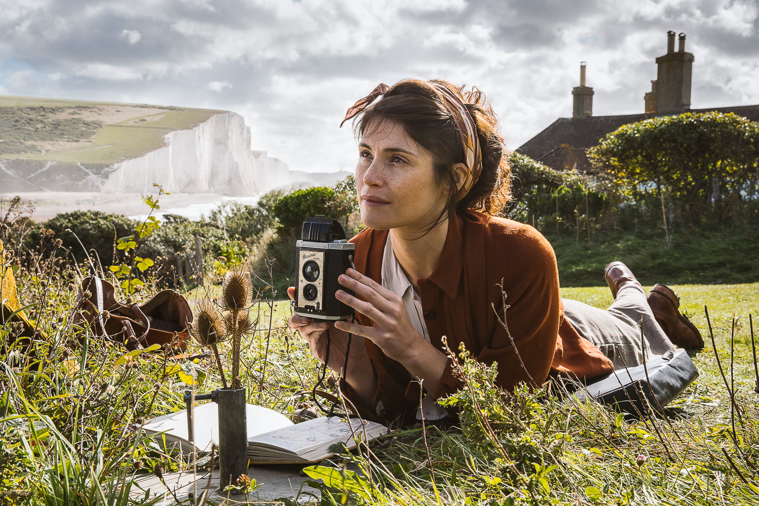
Just to give one example, the specific set up above didn’t end up being a poster, but it did create standout images for social media promotion in what has become, post pandemic, largely an online marketing campaign.
Just add text, and away you go
3. Matching Specials

On Set Specials shot in a pop up studio
Just as importantly, familiarity with the film’s aesthetics & cast meant that during the three days when I shot specials in an on-set studio (my more usual home), I tonally matched my lighting to the film’s visuals and was also able to draw out the nuance of character.
Consistency & Coherence
This blended approach gave marketing teams across territories a flexible and varied set of images for release, unified by a consistent tone and coherent sense of the film’s narrative.
The proof is in the pudding: studio images were composited onto plate landscape backgrounds and mixed interchangeably with stills imagery in design concepts. On-set stills with the production values of set-up shots stood out online and in print.
In fact, the international poster alone is made up of eight separate images woven together seamlessly by the Posterhouse team.
The space for happy chance
Of course, even with this careful approach, chance did play a part.
The shot that become the hero image across all campaigns was actually taken just before the second scene on my very first morning on set.
Spotting a beautiful composition that worked diagonally across the angle of filming, I practically begged for a moment or two to shoot from an (at-that-point) slightly sceptical crew.
The gaffer Stuart kindly bounced some soft reflector light in for me to counterbalance the sun, Gemma gave it some beautiful poise, and in 6 shots, it turns out we had a poster image
Summerland is released in UK cinemas and in the US from Friday 31st July.
See more of my advertising work for film, TV and theatre: here
